
Understand the Brand and Define the Concept of Adobe Illustrator
If you’re wondering how to create stunning logos in Adobe Illustrator, you’re in the right place. Creating a stunning logo is one of the most important skills a graphic designer can develop. A logo is not just a visual representation of a brand; it encapsulates a company’s values, identity, and mission. Adobe Illustrator, with its vector-based tools, is the ideal software for creating crisp, scalable logos. In this step-by-step guide, we’ll walk you through the process of creating a professional logo using Adobe Illustrator, from initial concept to final design
- What is the brand’s mission?
- Who is the target audience?
- What are the brand’s core values?
- What kind of style (modern, classic, playful, etc.) fits the brand?
Once you have this information, sketch out a few rough concepts on paper or digitally. Think about shapes, typography, and how to convey the brand’s message visually. Don’t worry about perfection in this phase—just focus on ideas.
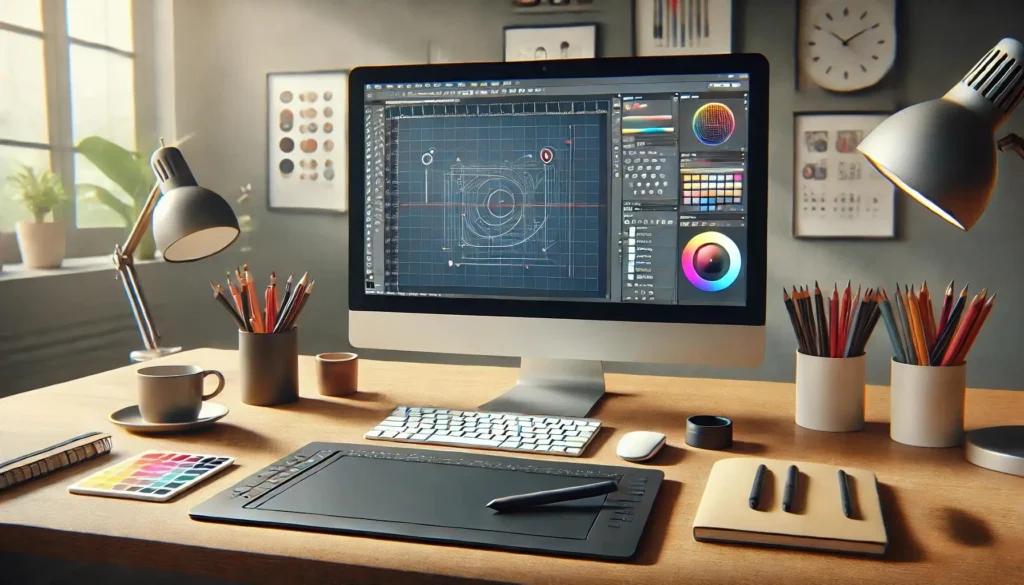
Step 2: Set Up Your Illustrator Document
Now that you have a rough concept, it’s time to start in Adobe Illustrator. Open Illustrator and create a new document by going to File > New.
- Artboard Size: Set the artboard size to 1000px by 1000px (a square artboard is ideal for logos, as it’s versatile for various uses).
- Color Mode: Choose RGB (Red, Green, Blue) color mode for digital designs, or CMYK (Cyan, Magenta, Yellow, Black) if the logo will primarily be printed.
This setup ensures you have enough space to work and a clear view of your design.
Step 3: Choose Your Logo Style
Logos come in several different styles. You can choose one based on your concept, the brand’s identity, and personal preference. Some common types of logos are:
- Wordmark: Focused entirely on typography (e.g., Google).
- Lettermark: A typographic logo made from initials (e.g., IBM).
- Pictorial Mark: A symbol or icon-based logo (e.g., Apple).
- Abstract Mark: A geometric form or shape representing the brand (e.g., Pepsi).
- Combination Mark: A mix of text and symbol (e.g., Adidas).
Decide on the type of logo that will best represent the brand and start refining your design in Illustrator.
Step 4: Create Basic Shapes and Symbols
Most logos are made up of simple shapes and clean lines. Illustrator’s vector tools—like the Pen Tool (P), Ellipse Tool (L), and Rectangle Tool (M)—are perfect for creating geometric shapes. Use these tools to construct the basic outline of your logo.
- If your logo is symbol-based, begin with basic shapes like circles, squares, or triangles. For example, to create a circle, select the Ellipse Tool (L), hold down Shift to maintain a perfect circle, and drag to create your desired size.
- For more intricate shapes, use the Pen Tool (P) to draw custom paths. With the Pen Tool, you can click to create straight lines or click and drag to create curves.
Remember to keep your shapes simple, as logos need to be recognizable at all sizes. A clean design will make it more effective and versatile.
Step 5: Refine and Combine Shapes
Once you’ve laid out the basic shapes for your logo, it’s time to combine and refine them. Illustrator allows you to manipulate and combine shapes in various ways.
- Use the Pathfinder Tool (Window > Pathfinder) to merge, subtract, or intersect shapes. This is perfect for creating more complex logos by combining simple shapes.
- The Direct Selection Tool (A) can be used to adjust individual anchor points, making your shapes more precise.
Ensure that your logo remains balanced. Whether you’re creating a symbol or working with text, make sure elements are aligned and proportionate.
Step 6: Add Typography
If your logo includes text, choosing the right typography is essential. The font you choose should complement the visual elements and fit the brand’s personality.
- Select a Typeface: Illustrator comes with a vast array of fonts. When choosing a typeface, make sure it’s legible at different sizes. For logos, sans-serif fonts often work well for modern and clean designs, while serif fonts may suit more traditional brands.
- Adjust Tracking and Kerning: Once you’ve chosen a font, use the Character panel to adjust the spacing between letters (kerning) and the overall spacing (tracking). Proper spacing ensures that your text is legible and looks balanced.
- Convert to Outlines: Once you’re happy with your text, convert it to outlines by selecting the text, right-clicking, and choosing Create Outlines. This will allow you to treat the text as a vector shape, giving you more control over the design.
Step 7: Add Color
Color is an important aspect of logo design, as it can evoke certain emotions and connect with the audience. Adobe Illustrator gives you full control over your logo’s color palette.
- Color Theory: Think about the psychology behind color. For example, blue is often associated with trust and professionalism, while red can represent energy or passion. Choose a color scheme that fits the brand’s identity.
- Use the Color Picker: Select the object or text you want to color and use the Color Picker to select a color. You can also experiment with gradients, but ensure that your logo works in both color and black-and-white formats.
Remember that simplicity is key. Limit the color palette to two or three colors to maintain clarity and avoid overcomplicating the design.
Step 8: Test and Refine
Once you’ve created your logo, step back and evaluate it. Consider how it will look in various formats, such as on business cards, websites, and social media. A good logo should work well in black and white, in small sizes, and at various resolutions.
- Test the logo at different scales. Ensure it remains clear and recognizable even when scaled down.
- Try your logo on different backgrounds (light and dark) to see if it maintains its integrity.
If needed, make adjustments to the shapes, text, or color to improve the overall impact of the logo.
Step 9: Save and Export Your Logo
Once you are satisfied with the final design, save your work in Illustrator’s native file format, .AI, so you can make future edits. However, for sharing or printing, you’ll need to export the logo in multiple formats:
- Export for Web: Save a PNG or JPG file for use on websites or digital media.
- Export for Print: Save as a high-resolution PDF or EPS file for print purposes. These formats maintain vector quality.
Go to File > Export to save your logo in the desired format.
Conclusion
Creating a stunning logo in Adobe Illustrator involves more than just technical skills it requires creativity, understanding of the brand, and attention to detail. By following this step-by-step guide, you can design a logo that’s not only visually appealing but also effective in conveying the essence of the brand it represents. Keep practicing, stay creative, and soon you’ll be able to create logos that leave a lasting impression.